Wonderist's Team Picks: Adult Dental Brands of 2024
Wonderist created 156 brands in 2024; here are the team's favorite Adult and Specialty practice logos. This year at Wonderist has been filled with incredible collaborations, and we're thrilled to share some of our favorite branding projects from 2024 for adult and specialty dental practices!

Each practice presented a unique challenge—and a unique opportunity—to create a brand identity that truly captured their essence. From sophisticated minimalism to playful nods to local culture, these designs showcase the power of thoughtful branding. Let's celebrate the designs that have resonated most with our team.
Smile Haven Dental Wellness
Smile Haven Dental Wellness' branding is a beautiful blend of modern and classic design. The unique combination of a star and a lotus flower, seamlessly integrated with the logo's interconnected "L" and "H," create a trend-forward and timeless mark. It's a sophisticated, memorable design that speaks to the practice's commitment to innovative care and enduring wellness.

The Smile Haus
The Smile Haus logo is a bold and minimalist statement. Its square shape, left-leaning orientation, and clean design create a powerful and memorable brand identity that’s both modern and impactful.

Sonoran Dental Studio
Sonoran Dental Studio’s logo cleverly incorporates a desert landscape within the shape of a tooth, reflecting the Arizona vibe. The color palette complements this idea, making the brand both eye-catching and connected to its location. It’s a simple yet effective design that really fits the practice.

Agape Smile Spa
Agape Smile Spa’s logo stands out with its playful yet elegant design—a horseshoe holding a small heart—that reflects the practice’s soothing, spa-like vibe. It strikes a nice balance between warmth and professionalism. The logo is both unique and memorable, conveying care and relaxation.

Murrysville Dental Center
Murrysville Dental Center’s logo blends elegance with simplicity. The detailed evergreen sprig adds a thoughtful touch, while the clean, lowercase font keeps the design approachable. It’s a sophisticated logo that’s both memorable and not too busy.
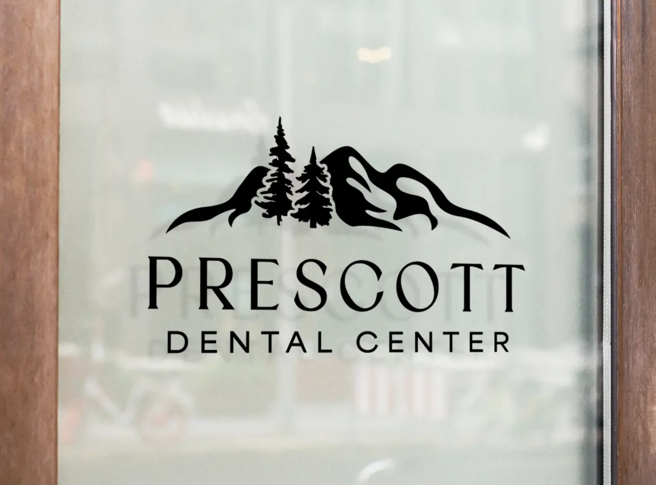
Prescot Dental Center
Prescott Dental Center's logo is a picture of calm and classic sophistication. The symmetrical design, featuring simplified trees and mountains, offers clean lines and exceptional legibility, creating a timeless and memorable brand identity.

Hyer Quality Dental
Hyer Quality Dental’s logo strikes a perfect balance of elegance and simplicity. The intertwined "H" and "Q" make for a unique and memorable monogram. The blue and beige color scheme enhances legibility, giving the brand a refined, professional look.

The Curve Dentistry
The Curve Dentistry's logo is one of those designs that just feels right. The "C" is so beautifully fluid, with its intertwined strokes, making it both eye-catching and unforgettable. And the secondary logo? It’s like the perfect little sidekick—clean, balanced, and just as sophisticated, giving the whole brand a polished, professional vibe.

La Rose Bleue Dental Studio
La Rose Bleue Dental Studio’s logo has such a charming, personal touch. The hand-drawn blue rose brings a bit of delicate artistry, while the French-inspired font adds a dash of sophistication. The soft blue palette ties it all together, giving the brand a calm, refined vibe that’s totally memorable.

Somnia
Somnia’s logo is like a little visual escape. The soft, circular design with its gentle half-starburst gives off a peaceful, relaxing vibe—just what you’d expect from a spa-like practice. It’s the kind of logo that instantly puts you at ease.
Specialist

San Diego Maxillo Facial Surgery
San Diego Maxillo Facial Surgery’s logo really stands out with its modern, bold design. The black-and-white color scheme is clean and sophisticated, while the font reflects San Diego’s coastal vibe. A subtle nod to layered faces adds depth, symbolizing both the practice's focus on appearance and the behind-the-scenes work that helps people face the world with confidence. It’s a perfect mix of innovation, relevance, and meaning.

San Marino Orthodontics
San Marino Orthodontics logo is a blend of professionalism and playfulness. The recognizable turtle subtly incorporates the doctor's personality, creating a design that's both memorable and approachable, successfully bridging the gap between orthodontic expertise and a fun, child-friendly atmosphere.

Firestone Endodontics
Firestone Endodontics' logo is a breath of fresh air. The stunning mid-century modern design, featuring a sun and mountains nestled within a circle, is visually captivating and unexpectedly soothing. It cleverly offsets the sometimes-daunting perception of endodontic procedures, creating a brand identity that’s both sophisticated and reassuring.

Fred Orthodontics
Fred Orthodontics' branding is a unique and delightful homage to its community. By referencing the iconic Vereins Kirche Museum, a local favorite in Fredericksburg, the logo creates a one-of-a-kind design that's both memorable and deeply connected to its surroundings. It's a fantastic example of how branding can celebrate local identity while establishing a strong practice image.
Bonus:

Off the Record w. Ali O - Podcast
The logo for *Off the Record with Ali Oromchian* is both nostalgic and playful. The design features classic microphone and recording elements, making it instantly recognizable and perfectly capturing the essence of the legal podcast. We’re also proud to have helped name the podcast, adding another layer to this unique and memorable brand.
These are just a few adult and specialty dental brands we’ve enjoyed working on this year. Each logo reflects our collaborations and creative vision with our clients. We're excited about our work and look forward to partnering with more practices to create brands that make a lasting impression.
Topics
